Garmin Fenix 7S: Guide to data extraction and analysis§

A versatile watch that is capable of tracking your heart rate, steps, and other metrics, the Garmin Fenix 7S is a watch that stores a treasure trove of health data that we will explore in this notebook.
We’ve used the Garmin Fenix 7S for a while now, and we’ll show you how to extract its data, visualize heart rate data, and compute correlations and other statistical measures based on your data! While you will need a Garmin Fenix 7S to actually collect the data itself, the data extraction requires only an internet connection and your username and password.
If you want to know more about the Garmin Fenix 7S, see the README for a detailed analysis of performances, sensors, data privacy, and extraction pipelines.
You can extract the parameters with known sampling frequencies as below:
Parameter Name |
Sampling Frequency |
|---|---|
Heart rate |
2 minutes |
Breaths per minute |
2 minutes |
Step Count |
15 minutes |
Stress (proxy for HRV) |
3 minutes |
Resting heart rate |
1 day |
Do note that the unofficial API we rely on and Garmin watch provide access to other values that may be automatically recorded: - sleep (awake vs. light vs. deep) - SpO2 levels
In this guide, we sequentially cover the following nine topics to extract from the unofficial Garmin API: 1. Setup 2. Authentication/Authorization - Requires only username and password, no OAuth. 3. Data extraction - We get data via wearipedia in a couple lines of code. 4. Data Exporting - We export all of this data to file formats compatible by R, Excel, and MatLab. 5. Adherence - We simulate non-adherence by dynamically removing datapoints from our simulated data.
6. Visualization - We create a simple plot to visualize our data. 7. Advanced visualization - 7.1: We plot a calendar heatmap of step counts every day, revealing which days the user has worn the watch. - 7.2: We reproduce a time series plot from the Garmin Connect website of heart rate and activity (steps) throughout a given day. 8. Outlier Detection and Data Cleaning - We detect outliers in our data and filter them out. 9. Data analysis - 9.1: We test whether activity (step
counts) and heart rates within 15 minute intervals are correlated and find a statistically significant relationship. - 9.2: We check for a correlation between breathing rate and heart rate, and find a statistically significant link. - Note that we are not making any scientific claims here as our sample size is small and the data collection process was not rigorously vetted (it is our own data), only demonstrating that this code could potentially be used to perform rigorous analyses in the
future.
Disclaimer: this notebook is purely for educational purposes. All of the data currently stored in this notebook is purely synthetic, meaning randomly generated according to rules we created. Despite this, the end-to-end data extraction pipeline has been tested on our own data, meaning that if you enter your own email and password on your own Colab instance, you can visualize your own real data. That being said, we were unable to thoroughly test the timezone functionality, though, since we only have one account, so beware.
1. Setup§
Participant Setup§
Dear Participant,
Once you unbox your Garmin Fenix 7S, please set up the device by following these resources: - Written guide: https://support.garmin.com/en-US/?faq=jvJTLgrDV881K1NXuC4CsA - Video guide: https://www.youtube.com/watch?v=Fgq6LM2NqNo
Make sure that your phone is paired to it using the Garmin Connect login credentials (email and password) given to you by the data receiver.
Best,
Wearipedia
Data Receiver Setup§
Please follow the below steps:
Create an email address for the participant, for example
foo@email.com.Create a Garmin Connect account with the email
foo@email.comand some random password.Keep
foo@email.comand password stored somewhere safe.Distribute the device to the participant and instruct them to follow the participant setup letter above.
Install the
wearipediaPython package to easily extract data from this device via the Garmin Connect API.
In this notebook, we will also install the july package for calendar plotting, but this is not strictly necessary.
[ ]:
!pip install git+https://rodrigo-castellon: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@github.com/rodrigo-castellon/wearipedia.git
!pip install july -q # for calendar plotting
Looking in indexes: https://pypi.org/simple, https://us-python.pkg.dev/colab-wheels/public/simple/
Collecting git+https://rodrigo-castellon:****@github.com/rodrigo-castellon/wearipedia.git
  Cloning https://rodrigo-castellon:****@github.com/rodrigo-castellon/wearipedia.git to /tmp/pip-req-build-rl_ycwoi
  Running command git clone -q 'https://rodrigo-castellon:****@github.com/rodrigo-castellon/wearipedia.git' /tmp/pip-req-build-rl_ycwoi
  Installing build dependencies ... done
  Getting requirements to build wheel ... done
    Preparing wheel metadata ... done
Requirement already satisfied: pandas<2.0,>=1.1 in /usr/local/lib/python3.8/dist-packages (from wearipedia==0.1.0) (1.3.5)
Requirement already satisfied: tqdm<5.0.0,>=4.64.1 in /usr/local/lib/python3.8/dist-packages (from wearipedia==0.1.0) (4.64.1)
Collecting wget<4.0,>=3.2
  Downloading wget-3.2.zip (10 kB)
Requirement already satisfied: scipy<2.0,>=1.6 in /usr/local/lib/python3.8/dist-packages (from wearipedia==0.1.0) (1.7.3)
Collecting typer[all]<0.7.0,>=0.6.1
  Downloading typer-0.6.1-py3-none-any.whl (38 kB)
Collecting rich<13.0.0,>=12.6.0
  Downloading rich-12.6.0-py3-none-any.whl (237 kB)
     |████████████████████████████████| 237 kB 9.3 MB/s
Collecting garminconnect<0.2.0,>=0.1.48
  Downloading garminconnect-0.1.49.tar.gz (17 kB)
Requirement already satisfied: requests in /usr/local/lib/python3.8/dist-packages (from garminconnect<0.2.0,>=0.1.48->wearipedia==0.1.0) (2.23.0)
Collecting cloudscraper
  Downloading cloudscraper-1.2.66-py2.py3-none-any.whl (98 kB)
     |████████████████████████████████| 98 kB 8.6 MB/s
Requirement already satisfied: pytz>=2017.3 in /usr/local/lib/python3.8/dist-packages (from pandas<2.0,>=1.1->wearipedia==0.1.0) (2022.6)
Requirement already satisfied: numpy>=1.17.3 in /usr/local/lib/python3.8/dist-packages (from pandas<2.0,>=1.1->wearipedia==0.1.0) (1.21.6)
Requirement already satisfied: python-dateutil>=2.7.3 in /usr/local/lib/python3.8/dist-packages (from pandas<2.0,>=1.1->wearipedia==0.1.0) (2.8.2)
Requirement already satisfied: six>=1.5 in /usr/local/lib/python3.8/dist-packages (from python-dateutil>=2.7.3->pandas<2.0,>=1.1->wearipedia==0.1.0) (1.15.0)
Requirement already satisfied: pygments<3.0.0,>=2.6.0 in /usr/local/lib/python3.8/dist-packages (from rich<13.0.0,>=12.6.0->wearipedia==0.1.0) (2.6.1)
Requirement already satisfied: typing-extensions<5.0,>=4.0.0 in /usr/local/lib/python3.8/dist-packages (from rich<13.0.0,>=12.6.0->wearipedia==0.1.0) (4.4.0)
Collecting commonmark<0.10.0,>=0.9.0
  Downloading commonmark-0.9.1-py2.py3-none-any.whl (51 kB)
     |████████████████████████████████| 51 kB 8.0 MB/s
Requirement already satisfied: click<9.0.0,>=7.1.1 in /usr/local/lib/python3.8/dist-packages (from typer[all]<0.7.0,>=0.6.1->wearipedia==0.1.0) (7.1.2)
Collecting colorama<0.5.0,>=0.4.3
  Downloading colorama-0.4.6-py2.py3-none-any.whl (25 kB)
Collecting shellingham<2.0.0,>=1.3.0
  Downloading shellingham-1.5.0-py2.py3-none-any.whl (9.3 kB)
Requirement already satisfied: pyparsing>=2.4.7 in /usr/local/lib/python3.8/dist-packages (from cloudscraper->garminconnect<0.2.0,>=0.1.48->wearipedia==0.1.0) (3.0.9)
Collecting requests-toolbelt>=0.9.1
  Downloading requests_toolbelt-0.10.1-py2.py3-none-any.whl (54 kB)
     |████████████████████████████████| 54 kB 3.1 MB/s
Requirement already satisfied: certifi>=2017.4.17 in /usr/local/lib/python3.8/dist-packages (from requests->garminconnect<0.2.0,>=0.1.48->wearipedia==0.1.0) (2022.9.24)
Requirement already satisfied: urllib3!=1.25.0,!=1.25.1,<1.26,>=1.21.1 in /usr/local/lib/python3.8/dist-packages (from requests->garminconnect<0.2.0,>=0.1.48->wearipedia==0.1.0) (1.24.3)
Requirement already satisfied: idna<3,>=2.5 in /usr/local/lib/python3.8/dist-packages (from requests->garminconnect<0.2.0,>=0.1.48->wearipedia==0.1.0) (2.10)
Requirement already satisfied: chardet<4,>=3.0.2 in /usr/local/lib/python3.8/dist-packages (from requests->garminconnect<0.2.0,>=0.1.48->wearipedia==0.1.0) (3.0.4)
Building wheels for collected packages: wearipedia, garminconnect, wget
  Building wheel for wearipedia (PEP 517) ... done
  Created wheel for wearipedia: filename=wearipedia-0.1.0-py3-none-any.whl size=39135 sha256=26efa116fa293777e4df8e7bf4e98b8cd987f7b3eb360c45104e047e79216f95
  Stored in directory: /tmp/pip-ephem-wheel-cache-nemlnbvd/wheels/52/1e/f8/8f0057d6273afb20fbea2450141dd24911d2c0da1f65c1c288
  Building wheel for garminconnect (setup.py) ... done
  Created wheel for garminconnect: filename=garminconnect-0.1.49-py3-none-any.whl size=12703 sha256=298196cc4fff0c99ff6b70dda3e3b27ae4d6952bc448cc59db2531b694d1f9ef
  Stored in directory: /root/.cache/pip/wheels/61/3c/19/189302584753d4b942618ca0b55da235b06389d561c8ba17fc
  Building wheel for wget (setup.py) ... done
  Created wheel for wget: filename=wget-3.2-py3-none-any.whl size=9674 sha256=f1721d4ca48da1d0b60678ce3f8b5181bf55d86fc2eec1a60fe77f89bf6e6cda
  Stored in directory: /root/.cache/pip/wheels/bd/a8/c3/3cf2c14a1837a4e04bd98631724e81f33f462d86a1d895fae0
Successfully built wearipedia garminconnect wget
Installing collected packages: requests-toolbelt, commonmark, typer, shellingham, rich, colorama, cloudscraper, wget, garminconnect, wearipedia
  Attempting uninstall: typer
    Found existing installation: typer 0.7.0
    Uninstalling typer-0.7.0:
      Successfully uninstalled typer-0.7.0
Successfully installed cloudscraper-1.2.66 colorama-0.4.6 commonmark-0.9.1 garminconnect-0.1.49 requests-toolbelt-0.10.1 rich-12.6.0 shellingham-1.5.0 typer-0.6.1 wearipedia-0.1.0 wget-3.2
2. Authentication/Authorization§
To obtain access to data, authorization is required. All you’ll need to do here is just put in your email and password for your Garmin Fenix 7S device. We’ll use this username and password to extract the data in the sections below.
[ ]:
#@title Enter Garmin login credentials
email_address = "jadongeathers@gmail.com" #@param {type:"string"}
password = "StanfordGarminD4ta" #@param {type:"string"}
3. Data Extraction§
Data can be extracted via wearipedia, our open-source Python package that unifies dozens of complex wearable device APIs into one simple, common interface.
First, we’ll set a date range and then extract all of the data within that date range. You can select whether you would like synthetic data or not with the checkbox.
[ ]:
#@title Enter start and end dates (in the format yyyy-mm-dd)

#set start and end dates - this will give you all the data from 2000-01-01 (January 1st, 2000) to 2100-02-03 (February 3rd, 2100), for example
start_date='2022-03-01' #@param {type:"string"}
end_date='2022-06-17' #@param {type:"string"}
synthetic = True #@param {type:"boolean"}
[ ]:
import wearipedia

device = wearipedia.get_device("garmin/fenix_7s")

if not synthetic:
    device.authenticate({"email": email_address, "password": password})

params = {"start_date": start_date, "end_date": end_date}

dates = device.get_data("dates", params=params)
steps = device.get_data("steps", params=params)
hrs = device.get_data("hrs", params=params)
brpms = device.get_data("brpms", params=params)
100%|██████████| 108/108 [00:24<00:00,  4.33it/s]
100%|██████████| 108/108 [00:00<00:00, 2557.53it/s]
100%|██████████| 108/108 [00:00<00:00, 10827.37it/s]
4. Data Exporting§
In this section, we export all of this data to formats compatible with popular scientific computing software (R, Excel, Google Sheets, Matlab). Specifically, we will first export to JSON, which can be read by R and Matlab. Then, we will export to CSV, which can be consumed by Excel, Google Sheets, and every other popular programming language.
Exporting to JSON (R, Matlab, etc.)§
Exporting to JSON is fairly simple. We export each datatype separately and also export a complete version that includes all simultaneously.
[ ]:
import json

# need to process `dates` into strings because it has datetime objects
dates_stringified = [d.strftime('%Y-%m-%d') for d in dates]

json.dump(dates_stringified, open("dates.json", "w"))
json.dump(steps, open("steps.json", "w"))
json.dump(hrs, open("hrs.json", "w"))
json.dump(brpms, open("brpms.json", "w"))

complete = {
    "dates": dates_stringified,
    "steps": steps,
    "hrs": hrs,
    "brpms": brpms
}

json.dump(complete, open("complete.json", "w"))
Feel free to open the file viewer (see left pane) to look at the outputs!
Exporting to CSV and XLSX (Excel, Google Sheets, R, Matlab, etc.)§
Exporting to CSV/XLSX requires a bit more processing, since they enforce a pretty restrictive schema.
We will thus export steps, heart rates, and breath rates all as separate files.
[ ]:
import pandas as pd

steps_concat = []

for steps_day in steps:
    steps_concat += steps_day

df = pd.DataFrame(steps_concat)
df.to_csv('steps.csv', index=False)
df.to_excel('steps.xlsx', index=False)

hrs_concat = []

for hrs_day in hrs:
    hrs_concat += hrs_day['heartRateValues']

df = pd.DataFrame(hrs_concat, columns=['timestamp', 'heart_rate'])
df.to_csv('hrs.csv', index=False)
df.to_excel('hrs.xlsx', index=False)

brpms_concat = []

for brpms_day in brpms:
    brpms_concat += brpms_day['respirationValuesArray']

df = pd.DataFrame(brpms_concat, columns=['timestamp', 'brpm'])
df.to_csv('brpms.csv', index=False)
df.to_excel('brpms.xlsx', index=False)
Again, feel free to look at the output files and download them.
5. Adherence§
The device simulator already automatically randomly deletes small chunks of the day. In this section, we will simulate non-adherence over longer periods of time from the participant (day-level and week-level).
Then, we will detect this non-adherence and give a Pandas DataFrame that concisely describes when the participant has had their device on and off throughout the entirety of the time period, allowing you to calculate how long they’ve had it on/off etc.
We will first delete a certain % of blocks either at the day level or week level, with user input.
[ ]:
#@title Non-adherence simulation
block_level = "day" #@param ["day", "week"]
adherence_percent = 0.74 #@param {type:"slider", min:0, max:1, step:0.01}
[ ]:
import numpy as np

if block_level == "day":
    block_length = 1
elif block_level == "week":
    block_length = 7

num_blocks = len(dates) // block_length

num_blocks_to_keep = int(adherence_percent * num_blocks)

idxes = np.random.choice(np.arange(num_blocks), replace=False, size=num_blocks_to_keep)

adhered_dates = []
adhered_steps = []
adhered_hrs = []
adhered_brpms = []

for i in range(num_blocks):
    if i in idxes:
        start = i * block_length
        end = (i + 1) * block_length
        for j, (date, step, hr, brpm) in enumerate(zip(dates[start:end], steps[start:end], hrs[start:end], brpms[start:end])):
            adhered_dates.append(date)
            adhered_steps.append(step)
            adhered_hrs.append(hr)
            adhered_brpms.append(brpm)

dates = adhered_dates
steps = adhered_steps
hrs = adhered_hrs
brpms = adhered_brpms
And now we have significantly fewer datapoints! This will give us a more realistic situation, where participants may take off their device for days or weeks at a time.
Now let’s detect non-adherence. We will return a Pandas DataFrame sampled at every 15 minutes.
[ ]:
from datetime import datetime

steps_concat = []
for step in steps:
    steps_concat += step

ts_col = pd.date_range(steps_concat[0]['startGMT'], steps_concat[-1]['endGMT'], freq="900s")
wearing_arr = np.zeros(len(ts_col))
for i, step in enumerate(steps_concat):
    ts = pd.Timestamp(step['startGMT'])
    idxes = np.where(ts_col == ts)[0]
    if len(idxes) == 1:
        wearing_arr[idxes[0]] = 1

df = pd.DataFrame()
df['timestamp'] = ts_col
df['is_wearing'] = wearing_arr.astype('bool')
We can plot this out, and we get adherence at a 15 minute frequency throughout the entirety of the data collection period.
[ ]:
import matplotlib.pyplot as plt

plt.figure(figsize=(12, 6))
plt.plot(df.timestamp, df.is_wearing)
[<matplotlib.lines.Line2D at 0x7fefa186dc40>]
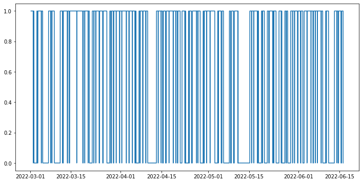
We can also turn this into a list of start and stop points.
[ ]:
from itertools import groupby

def contiguous_regions(a):
    i = 0
    res = []

    for k, g in groupby(a):
        l = len(list(g))
        if k:
            res.append((i,i+l))
        i += l

    return res

start_stops = [(df.timestamp[x[0]], df.timestamp[x[1]]) for x in contiguous_regions(df.is_wearing)]
start_stops
[(Timestamp('2022-03-01 07:00:00'), Timestamp('2022-03-02 00:45:00')),
 (Timestamp('2022-03-02 01:15:00'), Timestamp('2022-03-02 07:00:00')),
 (Timestamp('2022-03-03 07:00:00'), Timestamp('2022-03-03 10:45:00')),
 (Timestamp('2022-03-03 15:30:00'), Timestamp('2022-03-04 19:00:00')),
 (Timestamp('2022-03-04 20:45:00'), Timestamp('2022-03-05 07:00:00')),
 (Timestamp('2022-03-07 07:00:00'), Timestamp('2022-03-08 00:45:00')),
 (Timestamp('2022-03-08 01:00:00'), Timestamp('2022-03-08 11:00:00')),
 (Timestamp('2022-03-08 12:00:00'), Timestamp('2022-03-09 07:00:00')),
 (Timestamp('2022-03-11 07:00:00'), Timestamp('2022-03-12 01:45:00')),
 (Timestamp('2022-03-12 03:45:00'), Timestamp('2022-03-12 07:15:00')),
 (Timestamp('2022-03-12 08:45:00'), Timestamp('2022-03-13 17:00:00')),
 (Timestamp('2022-03-13 20:45:00'), Timestamp('2022-03-14 08:45:00')),
 (Timestamp('2022-03-14 13:15:00'), Timestamp('2022-03-16 23:00:00')),
 (Timestamp('2022-03-16 23:15:00'), Timestamp('2022-03-19 00:30:00')),
 (Timestamp('2022-03-19 04:15:00'), Timestamp('2022-03-19 16:45:00')),
 (Timestamp('2022-03-19 17:45:00'), Timestamp('2022-03-20 20:15:00')),
 (Timestamp('2022-03-20 20:30:00'), Timestamp('2022-03-21 07:00:00')),
 (Timestamp('2022-03-22 07:00:00'), Timestamp('2022-03-22 18:45:00')),
 (Timestamp('2022-03-22 21:00:00'), Timestamp('2022-03-23 11:00:00')),
 (Timestamp('2022-03-23 12:30:00'), Timestamp('2022-03-24 15:00:00')),
 (Timestamp('2022-03-24 19:15:00'), Timestamp('2022-03-25 20:30:00')),
 (Timestamp('2022-03-26 01:00:00'), Timestamp('2022-03-27 07:00:00')),
 (Timestamp('2022-03-28 07:00:00'), Timestamp('2022-03-28 15:30:00')),
 (Timestamp('2022-03-28 21:00:00'), Timestamp('2022-03-29 11:45:00')),
 (Timestamp('2022-03-29 16:00:00'), Timestamp('2022-03-30 11:15:00')),
 (Timestamp('2022-03-30 12:00:00'), Timestamp('2022-03-31 15:00:00')),
 (Timestamp('2022-03-31 17:00:00'), Timestamp('2022-04-01 09:15:00')),
 (Timestamp('2022-04-01 10:30:00'), Timestamp('2022-04-02 22:15:00')),
 (Timestamp('2022-04-03 00:30:00'), Timestamp('2022-04-03 20:00:00')),
 (Timestamp('2022-04-03 23:15:00'), Timestamp('2022-04-05 01:15:00')),
 (Timestamp('2022-04-05 01:45:00'), Timestamp('2022-04-05 21:30:00')),
 (Timestamp('2022-04-06 02:15:00'), Timestamp('2022-04-06 07:00:00')),
 (Timestamp('2022-04-07 07:00:00'), Timestamp('2022-04-07 14:30:00')),
 (Timestamp('2022-04-07 17:30:00'), Timestamp('2022-04-08 13:00:00')),
 (Timestamp('2022-04-08 16:45:00'), Timestamp('2022-04-09 13:45:00')),
 (Timestamp('2022-04-09 17:00:00'), Timestamp('2022-04-10 07:00:00')),
 (Timestamp('2022-04-13 07:00:00'), Timestamp('2022-04-13 21:00:00')),
 (Timestamp('2022-04-13 21:45:00'), Timestamp('2022-04-14 21:30:00')),
 (Timestamp('2022-04-14 22:00:00'), Timestamp('2022-04-15 09:15:00')),
 (Timestamp('2022-04-15 15:30:00'), Timestamp('2022-04-16 09:30:00')),
 (Timestamp('2022-04-16 16:00:00'), Timestamp('2022-04-17 14:00:00')),
 (Timestamp('2022-04-17 14:30:00'), Timestamp('2022-04-19 00:00:00')),
 (Timestamp('2022-04-19 02:15:00'), Timestamp('2022-04-19 21:30:00')),
 (Timestamp('2022-04-19 23:30:00'), Timestamp('2022-04-20 10:45:00')),
 (Timestamp('2022-04-20 15:15:00'), Timestamp('2022-04-21 10:15:00')),
 (Timestamp('2022-04-22 01:15:00'), Timestamp('2022-04-23 00:00:00')),
 (Timestamp('2022-04-23 04:15:00'), Timestamp('2022-04-23 07:00:00')),
 (Timestamp('2022-04-24 07:00:00'), Timestamp('2022-04-24 10:00:00')),
 (Timestamp('2022-04-24 14:15:00'), Timestamp('2022-04-25 07:15:00')),
 (Timestamp('2022-04-25 14:15:00'), Timestamp('2022-04-27 00:30:00')),
 (Timestamp('2022-04-27 01:30:00'), Timestamp('2022-04-27 12:45:00')),
 (Timestamp('2022-04-27 13:15:00'), Timestamp('2022-04-28 07:00:00')),
 (Timestamp('2022-04-29 07:00:00'), Timestamp('2022-04-29 10:45:00')),
 (Timestamp('2022-04-29 16:45:00'), Timestamp('2022-04-30 11:30:00')),
 (Timestamp('2022-04-30 13:00:00'), Timestamp('2022-05-01 15:15:00')),
 (Timestamp('2022-05-01 16:30:00'), Timestamp('2022-05-03 07:00:00')),
 (Timestamp('2022-05-04 07:00:00'), Timestamp('2022-05-04 12:30:00')),
 (Timestamp('2022-05-04 13:30:00'), Timestamp('2022-05-05 11:30:00')),
 (Timestamp('2022-05-05 18:00:00'), Timestamp('2022-05-06 07:00:00')),
 (Timestamp('2022-05-08 07:00:00'), Timestamp('2022-05-08 16:30:00')),
 (Timestamp('2022-05-08 23:30:00'), Timestamp('2022-05-09 16:45:00')),
 (Timestamp('2022-05-09 23:45:00'), Timestamp('2022-05-11 04:15:00')),
 (Timestamp('2022-05-11 06:15:00'), Timestamp('2022-05-11 07:00:00')),
 (Timestamp('2022-05-15 07:00:00'), Timestamp('2022-05-15 21:15:00')),
 (Timestamp('2022-05-15 22:45:00'), Timestamp('2022-05-16 15:30:00')),
 (Timestamp('2022-05-16 16:30:00'), Timestamp('2022-05-17 20:45:00')),
 (Timestamp('2022-05-18 00:30:00'), Timestamp('2022-05-18 07:00:00')),
 (Timestamp('2022-05-19 07:00:00'), Timestamp('2022-05-19 14:15:00')),
 (Timestamp('2022-05-19 15:45:00'), Timestamp('2022-05-20 07:00:00')),
 (Timestamp('2022-05-21 07:00:00'), Timestamp('2022-05-21 18:30:00')),
 (Timestamp('2022-05-21 23:15:00'), Timestamp('2022-05-23 03:30:00')),
 (Timestamp('2022-05-23 05:45:00'), Timestamp('2022-05-23 12:00:00')),
 (Timestamp('2022-05-23 13:30:00'), Timestamp('2022-05-24 07:00:00')),
 (Timestamp('2022-05-25 07:00:00'), Timestamp('2022-05-26 01:15:00')),
 (Timestamp('2022-05-26 02:15:00'), Timestamp('2022-05-26 07:00:00')),
 (Timestamp('2022-05-27 07:00:00'), Timestamp('2022-05-27 16:45:00')),
 (Timestamp('2022-05-27 21:00:00'), Timestamp('2022-05-28 07:00:00')),
 (Timestamp('2022-05-29 07:00:00'), Timestamp('2022-05-29 22:15:00')),
 (Timestamp('2022-05-29 23:15:00'), Timestamp('2022-05-30 13:45:00')),
 (Timestamp('2022-05-30 16:15:00'), Timestamp('2022-05-31 15:15:00')),
 (Timestamp('2022-05-31 19:45:00'), Timestamp('2022-06-01 15:30:00')),
 (Timestamp('2022-06-01 19:45:00'), Timestamp('2022-06-02 11:15:00')),
 (Timestamp('2022-06-02 22:15:00'), Timestamp('2022-06-03 21:00:00')),
 (Timestamp('2022-06-03 22:15:00'), Timestamp('2022-06-05 06:15:00')),
 (Timestamp('2022-06-05 06:30:00'), Timestamp('2022-06-05 22:30:00')),
 (Timestamp('2022-06-06 03:15:00'), Timestamp('2022-06-06 17:45:00')),
 (Timestamp('2022-06-06 18:15:00'), Timestamp('2022-06-07 10:30:00')),
 (Timestamp('2022-06-07 11:00:00'), Timestamp('2022-06-08 16:45:00')),
 (Timestamp('2022-06-08 19:45:00'), Timestamp('2022-06-09 07:00:00')),
 (Timestamp('2022-06-10 07:00:00'), Timestamp('2022-06-10 12:00:00')),
 (Timestamp('2022-06-10 13:30:00'), Timestamp('2022-06-11 07:00:00')),
 (Timestamp('2022-06-13 07:00:00'), Timestamp('2022-06-14 03:30:00')),
 (Timestamp('2022-06-14 04:15:00'), Timestamp('2022-06-14 13:30:00')),
 (Timestamp('2022-06-14 17:45:00'), Timestamp('2022-06-15 13:00:00')),
 (Timestamp('2022-06-15 18:30:00'), Timestamp('2022-06-16 07:00:00'))]
6. Visualization§
We’ve extracted lots of data, but what does it look like?
In this section, we will be visualizing our three kinds of data in a simple, customizable plot! This plot is intended to provide a starter example for plotting, whereas later examples emphasize deep control and aesthetics.
[ ]:
#@title Basic Plot
feature = "brpms" #@param ["brpms", "hrs", "steps"]
start_date = "2022-03-04" #@param {type:"date"}
time_interval = "one day" #@param ["one day", "one week", "full time"]
smoothness = 0.03 #@param {type:"slider", min:0, max:1, step:0.01}
smooth_plot = False #@param {type:"boolean"}

import matplotlib.dates as mdates
import matplotlib.pyplot as plt
from datetime import datetime, timedelta

start_date = datetime.strptime(start_date, '%Y-%m-%d')

if time_interval == "one day":
    day_idxes = [i for i,d in enumerate(dates) if d == start_date]
    end_date = start_date + timedelta(days=1)
elif time_interval == "one week":
    day_idxes = [i for i,d in enumerate(dates) if d >= start_date and d <= start_date + timedelta(days=7)]
    end_date = start_date + timedelta(days=7)
elif time_interval == "full time":
    day_idxes = [i for i,d in enumerate(dates) if d >= start_date]
    end_date = dates[-1]

if feature == "brpms":
    concat_brpms = []

    for i, brpm in enumerate(brpms):
        if i in day_idxes:
            concat_brpms += brpm['respirationValuesArray']

    ts = [datetime.fromtimestamp(x[0] / 1000) for x in concat_brpms]
    day_arr = [x[1] for x in concat_brpms]

    sigma = 200 * smoothness

    title_fillin = "Breathing rates"

elif feature == "hrs":
    concat_hrs = []

    for i, hr in enumerate(hrs):
        if i in day_idxes:
            concat_hrs += hr['heartRateValues']

    ts = [datetime.fromtimestamp(x[0] / 1000) for x in concat_hrs]
    day_arr = [x[1] for x in concat_hrs]

    sigma = 200 * smoothness

    title_fillin = "Heart rates"

elif feature == "steps":
    concat_steps = []

    for i, step in enumerate(steps):
        if i in day_idxes:
            concat_steps += step

    ts = [datetime.strptime(s['startGMT'], '%Y-%m-%dT%H:%M:%S') for s in concat_steps]
    day_arr = [s['steps'] for s in concat_steps]

    # "steps" has a weird quirk where instead of filling in missing
    # regions with None, it just doesn't fill them in with anything.
    # since matplotlib expects None values for parts of the line it
    # should not plot, we manually process this initial data so that
    # it contains None's
    spacing = timedelta(minutes=15)
    while True:
        for i, (ts1, ts2) in enumerate(zip(ts[:-1], ts[1:])):
            if (ts2 - ts1) != spacing:
                num_inserts = (ts2 - ts1) // spacing - 1

                new_ts = []
                new_data = []

                for j in range(1, num_inserts + 1):
                    new_ts.append(ts1 + j * spacing)
                    new_data.append(None)

                ts = ts[:i+1] + new_ts + ts[i+1:]
                day_arr = day_arr[:i+1] + new_data + day_arr[i+1:]
        else:
            break

    sigma = 10 * smoothness
    title_fillin = "Step counts"

with plt.style.context('ggplot'):
    fig, ax = plt.subplots(figsize=(15, 8))

    if smooth_plot:
        def to_numpy(day_arr):
            arr_nonone = [x for x in day_arr if x is not None]
            mean_val = int(np.mean(arr_nonone))
            for i,x in enumerate(day_arr):
                if x is None:
                    day_arr[i] = mean_val

            return np.array(day_arr)

        none_idxes = [i for i,x in enumerate(day_arr) if x is None]
        day_arr = to_numpy(day_arr)
        from scipy.ndimage import gaussian_filter
        day_arr = list(gaussian_filter(day_arr, sigma=sigma))
        for i, x in enumerate(day_arr):
            if i in none_idxes:
                day_arr[i] = None

    plt.plot(ts, day_arr)
    start_date_str = start_date.strftime('%Y-%m-%d')
    end_date_str = end_date.strftime('%Y-%m-%d')
    plt.title(f"{title_fillin} from {start_date_str} to {end_date_str}",
              fontsize=20)
    plt.xlabel("Time")
    plt.ylabel(title_fillin[:-1])
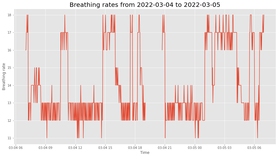
This plot allows you to quickly scan your data at many different time scales (day, week, and full) and for different kinds of measurements (heart rate, breath rate, step count), which enables easy and fast data exploration.
Furthermore, the smoothness parameter makes it easy to look for patterns in long-term trends.
7. Advanced Visualization§
Now we’ll do some more advanced plotting that at times features hardcore matplotlib hacking with the benefit of aesthetic quality.
Note that the timestamps that were extracted above correspond to days demarcated by midnight not necessarily in UTC, but rather where the user lives. To be precise, the timestamps themselves are in UTC, but the day element they belong to is determined by their location of residence.
7.1. Calendar plot of usage / step counts over time§
First, it’s important to know when the user has been wearing the device. That way, we know the high-level time frame for the measurements, and can know where to focus analysis on.
To figure this out, we’ll make a calendar plot. Fortunately, this idea is easy to execute with the use of `july <https://github.com/e-hulten/july/>`__, a custom library that allows us to create beautiful calendar plots. We’ll interpret step count as a proxy for usage and plot colors accordingly.
[ ]:
# sum across hour axis
import july
import matplotlib.pyplot as plt

# copy so we can restore the rcParams later on; july changes it
IPython_default = plt.rcParams.copy()

day_level_steps = [sum([x['steps'] for x in s]) / 1000 for s in steps]

july.calendar_plot(dates, day_level_steps, value_label=True, weeknum_label=False, title=False)
plt.suptitle('Step Count (in thousands)', fontsize="x-large", y=1.03)
plt.show()  # suppress output from above line
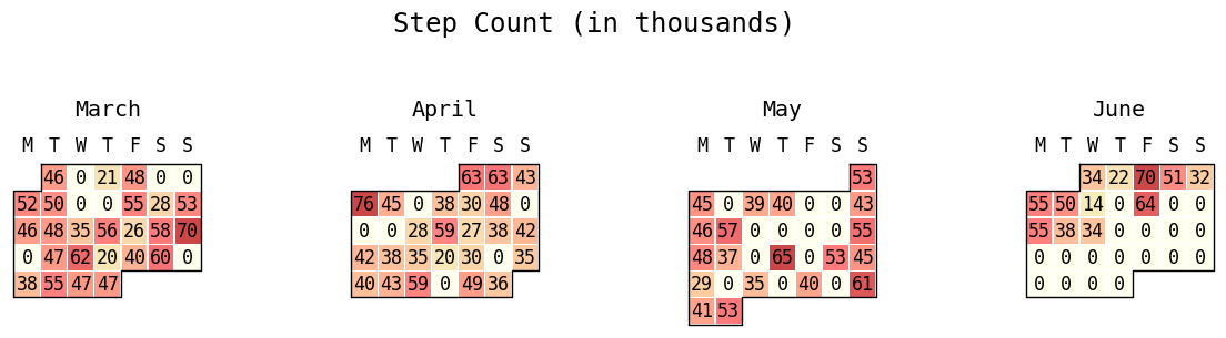
This plot is very important because we are able to gain a high-level overview of the usage patterns, which informs all further analysis. If we discover that the participant has not worn their watch at all or has stopped wearing it for an extended period of time, then this is crucial information for figuring out why downstream analyses may be returning unexpected results.
7.2. Heart rate, movement over a given day§
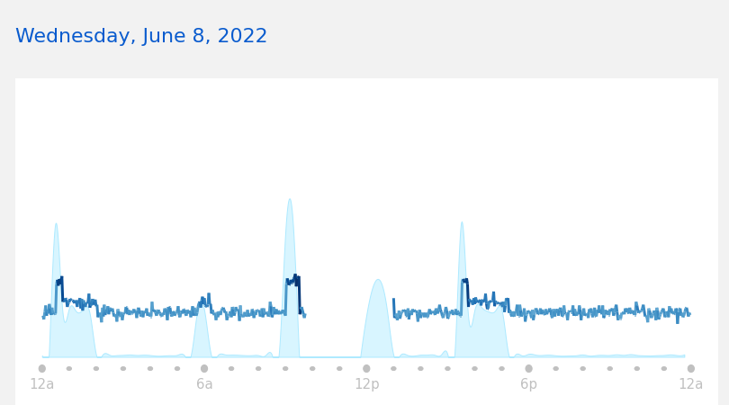
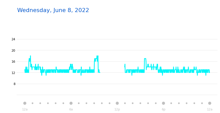
Now given this high-level information, we are equipped to dig into visualizing data from specific days. As a starter, let’s reproduce this plot from the online Garmin Connect webapp. All of the code is hidden away, so simply enter whichever date you want to view the data for.

Above is a plot from the online webapp itself!
[ ]:
# get rid of any garbage output
# https://stackoverflow.com/questions/56727370/how-to-suppress-output-in-google-colaboratory-cell-which-executes-a-command-line
#%%capture

#@title Choose a date to visualize (timezone is where the data was *collected*)
date_to_visualize = "2022-06-08" #@param {type:"date"}
timezone_name = "US/Pacific" #@param {type:"string"}

import numpy as np
import pandas as pd
from datetime import timedelta

import warnings
warnings.filterwarnings("ignore")

# restore rcParams
plt.rcParams.update(IPython_default)


# fetch the right day for heart rate
from datetime import datetime
idx = np.where(np.array([datetime.strftime(d, '%Y-%m-%d') for d in dates]) == date_to_visualize)[0][0]

heart_rate_day = np.array(hrs[idx]['heartRateValues'])

steps_day = steps[idx]

import matplotlib.pyplot as plt
import numpy as np
import matplotlib.collections as mcoll
import matplotlib.path as mpath
import matplotlib.dates as mdates
import matplotlib.ticker
import matplotlib.patches as patches
from scipy.interpolate import make_interp_spline
from dateutil import parser

from PIL import Image
import io
from IPython.core.interactiveshell import InteractiveShell
from IPython.display import clear_output

matplotlib.rcParams['timezone'] = timezone_name

# change the background to the same grey
plt.rcParams['figure.facecolor'] = '#f2f2f2'

def colorline(
    x, y, z=None, cmap=plt.get_cmap('copper'), norm=plt.Normalize(0.0, 1.0),
        linewidth=3, alpha=1.0, ax=None):
    """
    http://nbviewer.ipython.org/github/dpsanders/matplotlib-examples/blob/master/colorline.ipynb
    http://matplotlib.org/examples/pylab_examples/multicolored_line.html
    Plot a colored line with coordinates x and y
    Optionally specify colors in the array z
    Optionally specify a colormap, a norm function and a line width
    """

    # Default colors equally spaced on [0,1]:
    if z is None:
        z = np.linspace(0.0, 1.0, len(x))

    # Special case if a single number:
    if not hasattr(z, "__iter__"):  # to check for numerical input -- this is a hack
        z = np.array([z])

    z = np.asarray(z)

    segments = make_segments(x, y)
    lc = mcoll.LineCollection(segments, array=z, cmap=cmap, #norm=norm,
                              linewidth=linewidth, alpha=alpha)

    ax = plt.gca()

    ax.add_collection(lc)

    return lc


def make_segments(x, y):
    """
    Create list of line segments from x and y coordinates, in the correct format
    for LineCollection: an array of the form numlines x (points per line) x 2 (x
    and y) array
    """

    points = np.array([x, y]).T.reshape(-1, 1, 2)
    segments = np.concatenate([points[:-1], points[1:]], axis=1)
    return segments


fig = plt.figure(figsize=(14,6))

start = parser.parse(date_to_visualize + ' 00:00:00-07:00')

heart_rate_day = np.concatenate([
    [[int(start.timestamp() * 1000), None]],
    heart_rate_day
])


datetimes = [datetime.fromtimestamp(x // 1000) for x in heart_rate_day[:,0]]

datetimes_num = [mdates.date2num(x) for x in datetimes]

heart_rate_day_imputed = [x for x in heart_rate_day[:,1]]

heart_rate_day_imputed = [None] + heart_rate_day_imputed

for i, x in enumerate(heart_rate_day_imputed):
    if x is None:
        heart_rate_day_imputed[i] = 0

colorline(datetimes_num, heart_rate_day[:,1], np.array(heart_rate_day_imputed),
          cmap=plt.get_cmap('Blues'), linewidth=3)

ax = plt.gca()

steps_day_vals = np.array([x['steps'] for x in steps_day])

# smooth out and plot out on a minute basis
df = pd.DataFrame(columns=['datetime', 'steps_scaled'])

df.datetime = [parser.parse(x['startGMT']) for x in steps_day]
df.steps_scaled = steps_day_vals / 8 + 20

index_minutely = pd.date_range(df.datetime.iloc[0], df.datetime.iloc[-1], freq='1T')
spl = make_interp_spline(df.datetime, df.steps_scaled, k=3)
y_smooth = spl(index_minutely)

y_smooth = np.clip(y_smooth, 20, np.inf)

plt.fill_between(index_minutely, y_smooth, 20, edgecolor='#aeeaff',
                 facecolor='#d8f5ff', linewidth=1)

start = mdates.date2num(parser.parse(date_to_visualize + ' 00:00:00-07:00'))
end = mdates.date2num(parser.parse(date_to_visualize + ' 00:00:00-07:00') + timedelta(days=1))

# phantom rectangle to create space above the plot title
fig.patches.extend([patches.Rectangle((66.5, 400),
                                      100, 60, facecolor='#f2f2f2', zorder=-999999)])

# phantom rectangle to deal with the fact that the rectangle written
# just below creates a huge area of space to the left, so we equalize
# on the right with a phantom rectangle
fig.patches.extend([patches.Rectangle((66.5, 10),
                                      900, 50, facecolor='#f2f2f2', zorder=-999999)])

# rectangle to extend white background of the axis down further
# so that the ticks are not cut off
fig.patches.extend([patches.Rectangle((66.5, 10),
                                      781.5, 50, facecolor='white', zorder=-999999)])

plt.xticks(ticks=np.linspace(start, end, 5), labels=['12a', '6a', '12p', '6p', '12a'])

plt.tick_params(
    axis='x',
    which='both',
    labelsize=15,
    labelcolor='silver',
    width=0  # set width to zero so that the ticks themselves are invisible
)

# just don't have any y ticks
ax.set_yticks(ticks=[])
ax.set_yticklabels([])

TICKYPOS = 4

for tick_x in np.linspace(start, end, 5):
    r = 10
    # for some reason, width should be .001x of the height for it
    # to be a circle

    ax.add_patch(patches.Ellipse((tick_x,TICKYPOS), .001 * r, 1 * r,
                                fill=True,clip_on=False, color='silver'))


# pseudo-minor ticks
for tick_x in np.linspace(start, end, 5 * 5):
    r = 5
    # for some reason, width should be .001x of the height for it
    # to be a circle

    ax.add_patch(patches.Ellipse((tick_x,TICKYPOS), .0015 * r, 1 * r,
                                fill=True,clip_on=False, color='silver'))


# hide the borders of the box (https://stackoverflow.com/questions/9750699/how-to-display-only-a-left-and-bottom-box-border-in-matplotlib)
for side in ['left', 'right', 'top', 'bottom']:
    ax.spines[side].set_visible(False)

plt.xlim(datetimes[0] - timedelta(hours=1),
         datetimes[0] + timedelta(days=1) + timedelta(hours=1))

date_to_visualize_fmted = datetime.strftime(datetime.strptime(date_to_visualize, '%Y-%m-%d'), '%A, %B %-d, %Y')

plt.title(f'{date_to_visualize_fmted}' + ' ' * 72, loc='left',
          fontsize=22, color='#095bce', pad=40)#, bbox={'facecolor':'white', 'edgecolor': 'white', 'alpha':1.0, 'pad':4})

ax.set_ylim(0, 400)

# ok this is super convoluted but what we're doing here is
# reaching super super deep into the matplotlib stack, actually deeper than matplotlib.
# we fetch the *backend renderer* (the thing that takes a fig object and turns it into pixels
# to display on the interactive colab screen), run it on the fig object as would be done
# when doing inline matplotlib in any other case, open the PNG bytestring, crop it,
# then display this cropped image. the reason why we need to do this is because usually
# as a user of matplotlib all we can control is the fig object, but not how it's rendered (which means
# we can't actually crop it unfortunately).

# TL;DR: can't crop via matplotlib interface, so we render the figure ourselves
# manually and crop it afterwards

colab_output_as_png_bytes = InteractiveShell.instance().display_formatter.formatters['image/png'](fig)

img = Image.open(io.BytesIO(colab_output_as_png_bytes))

# crop out the fat borders on the left and right
cropped = img.crop((50, 0, 860, 450))

# delete the figure used to construct the img above
plt.figure(plt.get_fignums()[0]).clear()

# make sure there is no garbage output
plt.show()
clear_output()

# display the cropped image
cropped
Above is a plot we created ourselves!
This plot is important because it allows us to dive deep into the fine-grained heart rates throughout a given day. This gives you a very quick at-a-glance idea of what the heart rate patterns for this user look like at the scale of a single day, which cannot be determined from an aggregate plot (such as the calendar one above).
7.3. Breath rate over a given day§
Next, we will reproduce the below plot that you can see in the Garmin Connect webapp.

[ ]:
# get rid of any garbage output
# https://stackoverflow.com/questions/56727370/how-to-suppress-output-in-google-colaboratory-cell-which-executes-a-command-line
#%%capture

#@title Choose a date to visualize (timezone is where the data was *collected*)
date_to_visualize = "2022-06-08" #@param {type:"date"}
timezone_name = "US/Pacific" #@param {type:"string"}

import warnings
warnings.filterwarnings("ignore")

# restore rcParams
plt.rcParams.update(IPython_default)


# fetch the right day for heart rate
from datetime import datetime
idx = np.where(np.array([datetime.strftime(d, '%Y-%m-%d') for d in dates]) == date_to_visualize)[0][0]

heart_rate_day = np.array(hrs[idx]['heartRateValues'])

heart_rate_day = np.array(brpms[idx]['respirationValuesArray'])

steps_day = steps[idx]

import matplotlib.pyplot as plt
import numpy as np
import matplotlib.collections as mcoll
import matplotlib.path as mpath
import matplotlib.dates as mdates
import matplotlib.ticker
import matplotlib.patches as patches
from scipy.interpolate import make_interp_spline
from dateutil import parser

from PIL import Image
import io
from IPython.core.interactiveshell import InteractiveShell
from IPython.display import clear_output

matplotlib.rcParams['timezone'] = timezone_name

# change the background to the same grey
plt.rcParams['figure.facecolor'] = 'white'

fig = plt.figure(figsize=(14,6))

start = parser.parse(date_to_visualize + ' 00:00:00-07:00')

heart_rate_day = np.concatenate([
    [[int(start.timestamp() * 1000), None]],
    heart_rate_day
])


datetimes = [datetime.fromtimestamp(x // 1000) for x in heart_rate_day[:,0]]

datetimes_num = [mdates.date2num(x) for x in datetimes]

heart_rate_day_imputed = [x for x in heart_rate_day[:,1]]

heart_rate_day_imputed = [None] + heart_rate_day_imputed

for i, x in enumerate(heart_rate_day_imputed):
    if x is None:
        heart_rate_day_imputed[i] = 0

heart_rate_day_imputed = np.array(heart_rate_day_imputed)

# get the contiguous regions in heart_rate_day to plot
# these separately
empty_idxes = np.where(heart_rate_day_imputed[1:] >= 0)[0]

regions = []

cur_region_start = -1

cur_region_end = -1

for idx1, idx2 in zip(empty_idxes[:-1], empty_idxes[1:]):
    if cur_region_start == -1:
        cur_region_start = idx1
        cur_region_end = idx2

    if idx2 - idx1 > 1:
        cur_region_end = idx1
        # add 1 to account for extra dummy entry in heart_rate_day
        # at the beginning
        regions.append((cur_region_start+1, cur_region_end+1))

        cur_region_start = -1
        cur_region_end = -1
else:
    # special condition for last region
    regions.append((cur_region_start+1, empty_idxes.shape[0]))

for region_start, region_end in regions:
    plt.plot(datetimes_num[region_start:region_end],
             heart_rate_day[region_start:region_end],
             linewidth=3, color='#00f5f8')

ax = plt.gca()

steps_day_vals = np.array([x['steps'] for x in steps_day])

# smooth out and plot out on a minute basis
df = pd.DataFrame(columns=['datetime', 'steps_scaled'])

df.datetime = [parser.parse(x['startGMT']) for x in steps_day]
df.steps_scaled = steps_day_vals / 8 + 20

index_minutely = pd.date_range(df.datetime.iloc[0], df.datetime.iloc[-1], freq='1T')
spl = make_interp_spline(df.datetime, df.steps_scaled, k=3)
y_smooth = spl(index_minutely)

y_smooth = np.clip(y_smooth, 20, np.inf)

#plt.fill_between(index_minutely, y_smooth, 20, edgecolor='#aeeaff',
                 #facecolor='#d8f5ff', linewidth=1)

start = mdates.date2num(parser.parse(date_to_visualize + ' 00:00:00-07:00'))
end = mdates.date2num(parser.parse(date_to_visualize + ' 00:00:00-07:00') + timedelta(days=1))

# phantom rectangle to create space above the plot title
fig.patches.extend([patches.Rectangle((66.5, 400),
                                      100, 60, facecolor='white', zorder=-999999)])

# phantom rectangle to deal with the fact that the rectangle written
# just below creates a huge area of space to the left, so we equalize
# on the right with a phantom rectangle
#fig.patches.extend([patches.Rectangle((66.5, 10),
#                                      900, 50, facecolor='#f2f2f2', zorder=-999999)])

# rectangle to extend white background of the axis down further
# so that the ticks are not cut off
#fig.patches.extend([patches.Rectangle((66.5, 10),
#                                      781.5, 50, facecolor='white', zorder=-999999)])

plt.xticks(ticks=np.linspace(start, end, 5), labels=['12a', '6a', '12p', '6p', '12a'])

plt.tick_params(
    axis='x',
    which='both',
    labelsize=12,
    labelcolor='silver',
    width=0  # set width to zero so that the ticks themselves are invisible
)

# just don't have any y ticks
plt.yticks(ticks=[4,8,12,16,20,24], labels=['','8','12','16','20','24'])
plt.tick_params(
    axis='y',
    which='both',
    color='gainsboro',
    labelsize=12
)
#ax.set_yticks(ticks=[])
#ax.set_yticklabels([])

TICKYPOS = 1

for tick_x in np.linspace(start, end, 5):
    r = 10
    # for some reason, width should be .001x of the height for it
    # to be a circle

    #ax.add_patch(patches.Rectangle((tick_x, TICKYPOS), 10, 10, linewidth=1, edgecolor='black', facecolor='black'))

    ax.add_patch(patches.Ellipse((tick_x,TICKYPOS), .0015 * r, .1 * r,
                                fill=True,clip_on=False, color='silver'))


# pseudo-minor ticks
for tick_x in np.linspace(start, end, 5 * 5):
    r = 5
    # for some reason, width should be .001x of the height for it
    # to be a circle

    ax.add_patch(patches.Ellipse((tick_x,TICKYPOS), .0015 * r, .1 * r,
                                fill=True,clip_on=False, color='silver'))


# hide the borders of the box (https://stackoverflow.com/questions/9750699/how-to-display-only-a-left-and-bottom-box-border-in-matplotlib)
for side in ['left', 'right', 'top', 'bottom']:
    ax.spines[side].set_visible(False)

plt.xlim(datetimes[0] - timedelta(hours=1),
         datetimes[0] + timedelta(days=1) + timedelta(hours=1))

date_to_visualize_fmted = datetime.strftime(datetime.strptime(date_to_visualize, '%Y-%m-%d'), '%A, %B %-d, %Y')

plt.title(f'{date_to_visualize_fmted}' + ' ' * 72, loc='left',
          fontsize=22, color='#095bce', pad=40)#, bbox={'facecolor':'white', 'edgecolor': 'white', 'alpha':1.0, 'pad':4})

ax.set_ylim(0, 30)

#plt.grid()
#ax.yaxis.grid(which="major", color='r', linestyle='-', linewidth=2, zorder=999999999999)
#ax.grid(b=True, which='major', color='b', linestyle='-')
plt.grid(color='gainsboro', which='major', axis='y', linestyle='solid')

#ax.xaxis.grid()
#ax.grid(True)
#ax.grid(axis='x', zorder=0)

plt.show()
Above is a plot we created ourselves!
As you can see, we’re able to recover visualizations from the webapp pretty flawlessly!
This plot is important for the same reason that the heart rate plot is important: it allows us to see what the participant’s breathing rate is throughout a given day, which gives us a granularity of data visualization that we are otherwise unable to obtain.
8. Outlier Detection and Data Cleaning§
In this section, we will detect outliers in our extracted data and impute them.
Since there are currently no outliers (by construction, since it is simulated to have none), we will manually inject a couple.
[ ]:
hrs[0]['heartRateValues'][5][1] = 5
brpms[0]['respirationValuesArray'][52][1] = 92
Now that we’ve manually injected them, let’s demonstrate that we can detect these.
We will use a simple statistical method for detecting outliers. Specifically, we will rely on the assumption that heart rate and breath rate signals roughly do not change very much from one timestep to the next, and that if there is one measurement that very clearly sticks up much higher than the rest surrounding it, then it is likely an outlier.
We will capture this notion by computing a convolution across both arrays with the kernel [-1 2 -1]. If the signal does not change at all, then this will return 0, and this is what we would expect under normal conditions. However, if there is a clear outlier, then it will return a very large number.
[ ]:
hrs_concat = []

for hr in hrs:
    hrs_concat += hr['heartRateValues']

brpms_concat = []
for brpm in brpms:
    brpms_concat += brpm['respirationValuesArray']

def get_conv_outs(concat_arr):
    conv_outs = []

    for i, (x1, x2, x3) in enumerate(zip(concat_arr[:-2], concat_arr[1:-1], concat_arr[2:])):
        if x2[0] - x1[0] == x3[0] - x2[0] == 120000 and all([x[1] is not None for x in [x1,x2,x3]]):
            conv_out = x1[1] * (-1) + x2[1] * 2 + x3[1] * (-1)

            conv_outs.append([i + 1, conv_out])

    conv_outs = np.array(conv_outs)

    return conv_outs

conv_brpms = get_conv_outs(brpms_concat)
conv_hrs = get_conv_outs(hrs_concat)
Now let’s fit a Gaussian to it and calculate the Z-scores for each entry.
[ ]:
res_hrs_mean = conv_hrs[:,1].mean()
res_hrs_std = conv_hrs[:,1].std()

res_brpms_mean = conv_brpms[:,1].mean()
res_brpms_std = conv_brpms[:,1].std()
We will find any elements that deviate by more than \(6\sigma\) from the mean, consider these outliers, and impute their value in the original data.
[ ]:
def get_orig_idxes(conv_arr, res_mean, res_std):

    idxes = np.where(np.logical_or(conv_arr[:,1] > res_mean + 6 * res_std, conv_arr[:,1] < res_mean - 6 * res_std))[0]

    # we assume that there are always three contiguous idxes that
    # get flagged
    i = 1
    orig_idxes = []
    while i < len(idxes):
        orig_idx = conv_arr[idxes[i], 0]
        orig_idxes.append(orig_idx)
        i += 3

    return orig_idxes

orig_idxes_hrs = get_orig_idxes(conv_hrs, res_hrs_mean, res_hrs_std)
orig_idxes_brpms = get_orig_idxes(conv_brpms, res_brpms_mean, res_brpms_std)
[ ]:
ts = [brpms_concat[orig_idx][0] for orig_idx in orig_idxes_brpms]

ctx_length = 10

for i, brpm in enumerate(brpms):
    cur_arr = np.array(brpm['respirationValuesArray'])
    idxes = np.where(np.in1d(cur_arr[:,0], ts))[0]

    if len(idxes) == 1:
        idx = idxes[0]
        ctx = np.concatenate((cur_arr[idx-ctx_length:idx,1], cur_arr[idx+1:idx+1+ctx_length,1]))
        mean_val = int(np.mean(ctx))
        print(f'replacing {brpms[i]["respirationValuesArray"][idx]} with {mean_val}, obtained by averaging around it')
        print(f'index in brpms array is {i} and index within that is {idx}')
        brpms[i]['respirationValuesArray'][idx][1] = mean_val


ts = [hrs_concat[orig_idx][0] for orig_idx in orig_idxes_hrs]

for i, hr in enumerate(hrs):
    cur_arr = np.array(hr['heartRateValues'])
    idxes = np.where(np.in1d(cur_arr[:,0], ts))[0]

    if len(idxes) == 1:
        idx = idxes[0]
        ctx = np.concatenate((cur_arr[idx-ctx_length:idx,1], cur_arr[idx+1:idx+1+ctx_length,1]))
        mean_val = int(np.mean(ctx))
        print(f'replacing {hrs[i]["heartRateValues"][idx]} with {mean_val}, obtained by averaging around it')
        print(f'index in hrs array is {i} and index within that is {idx}')
        hrs[i]['heartRateValues'][idx][1] = mean_val
replacing [1646124240000, 92] with 17, obtained by averaging around it
index in brpms array is 0 and index within that is 52
replacing [1646118600000, 5] with 124, obtained by averaging around it
index in hrs array is 0 and index within that is 5
And we have properly cleaned up this data of outliers!
Disclaimer: though this code is capable of catching the outliers we injected ourselves, in your specific situation there may be outliers this does not catch.
9. Data Analysis§
Data isn’t much without some analysis, so we’re going to do some in this section.
DISCLAIMER: do not use the analyses below as evidence supporting any scientific claims. These analyses are purely intended for educational purposes.
9.1. Heart rate vs. activity§
This first analysis will be a sanity check to make sure that indeed heart rate does increase when more steps are taken (and thus there is more activity). To be more specific, we would like to test the hypothesis that a higher step count is associated with a higher heart rate.
First, to get an intuitive understanding of the data, we can aggregate all of the datapoints and show a scatterplot of heart rates and step counts. This will take a bit of data manipulation, as step measurements are sampled only every 15 minutes and contain a count, whereas heart rate measurements are distinct measurements taken every 2 minutes.
To do this, we’ll find every instance of a 15 minute interval that has (1) a recorded step count and (2) at least 3 heart rate measurements (we choose 3 arbitrarily, but should be enough to have enough certainty about the true heart rate throughout this time period). This means that, in the end, we’ll have a set of tuples \(x_i\), where each tuple \(x_i\) contains the step count for the given 15 minute interval and a list of heart rates. We’ll choose to take the median of the list of heart rates, so we’ll end up with tuples \((\text{step count}, \text{median heart rate})\).
[ ]:
from tqdm import tqdm
from dateutil import parser

# flatten all the heart rate data

all_hrs_flat = []
for hr_arr in tqdm(hrs):
    if hr_arr['heartRateValues'] is None:
        continue

    hr_vals = np.array(hr_arr['heartRateValues'])

    if None in hr_vals[:,1]:
        while True:
            # keep consuming None's until we've run out
            idxes = np.where(hr_vals[:, 1] == None)[0]

            if len(idxes) == 0:
                break

            idx = idxes[0]

            hr_vals = np.concatenate([hr_vals[:idx], hr_vals[idx+1:]])


    all_hrs_flat += list(hr_vals)

all_hrs_flat = np.array(all_hrs_flat)

# flatten all the steps data

all_steps_flat = []

for step_day in tqdm(steps):
    all_steps_flat += [[int(parser.parse(x['startGMT']).timestamp() * 1000), x['steps']] for x in step_day]

all_steps_flat = np.array(all_steps_flat)
100%|██████████| 79/79 [00:00<00:00, 1761.72it/s]
100%|██████████| 79/79 [00:00<00:00, 146.93it/s]
Now that we have flattened step and heart rate data, we can cross-reference and find heart rate measurements corresponding to particular 15 minute intervals!
[ ]:
cooccurrences = []

for step_start, step_count in tqdm(all_steps_flat):
    coreference = np.where(np.logical_and(all_hrs_flat[:,0] - step_start >= 0, all_hrs_flat[:,0] - step_start <= 15 * 60 * 1000))[0]

    hr_15_minutes = all_hrs_flat[coreference, 1]

    if len(coreference) >= 3:
        cooccurrences.append([step_count, hr_15_minutes])
100%|██████████| 6677/6677 [00:41<00:00, 162.28it/s]
[ ]:
cooccurrences_median = np.vstack([[x[0] for x in cooccurrences], [np.median(x[1]) for x in cooccurrences]]).T
df = pd.DataFrame(cooccurrences_median, columns=['Step count', 'Median heart rate'])
[ ]:
import seaborn as sns

sns.jointplot(x='Step count', y='Median heart rate', data=df)
<seaborn.axisgrid.JointGrid at 0x7fefa01bc280>
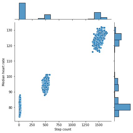
Looks like there is indeed a trend here, but an aggressive critic might argue that it could result from chance. To provide strong quantitative evidence in favor of our claim, which is that the null hypothesis (higher step counts do not have higher heart rates) is indeed false, we perform the Wald test, which addresses this setting precisely.
[ ]:
from scipy import stats
slope, intercept, r_value, p_value, std_err = stats.linregress(df['Step count'],
                                                               df['Median heart rate'],
                                                               alternative='greater')

print(f'Slope: {slope:.3g}')
print(f'Coefficient of determination: {r_value**2:.3g}')
print(f'p-value: {p_value:.3g}')
Slope: 0.0299
Coefficient of determination: 0.988
p-value: 0
As we can see, the p-value, or the probability that assuming the slope is zero that we have obtained a slope of at least this magnitude, is extremely small <.05, so this is a significant result and we can thus reject the null hypothesis that higher step counts are not associated with higher heart rates.
9.2. Heart rate vs. breaths per minute§
We may also be interested in understanding the relationship between the number of breaths the user takes per minute and the corresponding heart rate. In this situation, we would probably expect higher heart rates to be associated with a higher breath rate.
To get an intuitive idea of the data, we first plot it out.
To do this, we cross-reference heart rates and breaths per minutes extracted earlier in a similar way to what was done for section 9.1. Specifically, we first flatten the brpms array we extracted earlier.
[ ]:
brpms_flat = []

for brpm_dict in tqdm(brpms):
    if brpm_dict['respirationValuesArray'] is not None and len(brpm_dict['respirationValuesArray']) > 0:
        brpms_flat += brpm_dict['respirationValuesArray']

brpms_flat = np.array(brpms_flat, dtype='object')
100%|██████████| 79/79 [00:00<00:00, 65034.35it/s]
Now that we’ve flattened it, we must cross-reference. Note that though the breathing rate and heart rate could be sampled at different times, complicating the analysis, we conveniently have that >99% of the heart rate measurements have a one-to-one corresponding breathing rate per minute measurement recorded at exactly the same time (see below). (Note: in the synthetic case, we just generated data that had 100% correspondence)
Therefore, we can just correlate as done in the simple case.
[ ]:
mismatch_count = 0

double_list = []
if synthetic:
    for i, (hr_timestamp, hr) in tqdm(enumerate(all_hrs_flat)):
        double_list.append([hr, brpms_flat[i][1]])
else:
    for hr_timestamp, hr in tqdm(all_hrs_flat):
        match_idxes = np.where(np.abs(brpms_flat[:,0] - hr_timestamp) == 0)[0]
        if len(match_idxes) == 0:
            mismatch_count += 1
            continue

        assert(len(match_idxes) == 1)

        double_list.append([hr, brpms_flat[match_idxes[0]][1]])

print(f'\n% of heart rate measurements with no corresponding brpm: {mismatch_count / len(all_hrs_flat) * 100:.3g}%')
50102it [00:00, 467325.11it/s]
% of heart rate measurements with no corresponding brpm: 0%
Let’s plot this out to see what it looks like.
[ ]:
sns.set(rc = {'figure.figsize':(18,6)})

df = pd.DataFrame(double_list, columns=['Heart rate', 'Breaths per minute'])

# filter out seemingly missing values for breaths
df = df[df['Breaths per minute'] > 0]

sns.boxplot(y='Heart rate', x='Breaths per minute', data=df)
<matplotlib.axes._subplots.AxesSubplot at 0x7fef9ed26520>
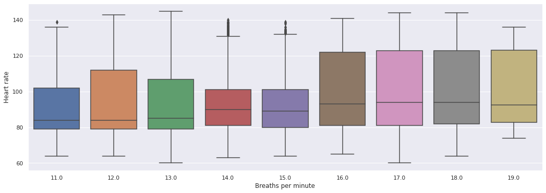
Looks like there’s a correlation! Let’s verify that it is not due to chance now. To be precise, our null hypothesis in this situation is that heart rates do not increase as breaths per minute increase. Again, as was the case before, we use the Wald test, which addresses exactly this setting.
[ ]:
from scipy import stats
slope, intercept, r_value, p_value, std_err = stats.linregress(df['Heart rate'],
                                                               df['Breaths per minute'],
                                                               alternative='greater')

print(f'Slope: {slope:.3g}')
print(f'Coefficient of determination: {r_value**2:.3g}')
print(f'p-value: {p_value:.3g}')
Slope: 0.0151
Coefficient of determination: 0.0223
p-value: 1.77e-247
We see that the p-value is low (<0.05), so we can reject the null hypothesis and conclude that higher breath rates are linked to higher heart rates.